The World Health Organisation (WHO) Systems Performance Assessment (HPSA) model lists four core functions of health systems: governance, financing, resource generation and service delivery. Immunisation coverage, immunisation dropout rates and health facility density are dimensions within the service delivery arm.1
Immunization prevents nearly 3 million child deaths globally each year.2 At the national level, the routine immunisation (RI) scheme is the primary strategy for ensuring that eligible children receive vaccinations through the health system.3,4 The percentage of children who have received the third dose of a Diphtheria-Tetanus-Pertussis containing vaccine (DTP3) by one year is the WHO recommended proxy measure for routine immunisation coverage. It is one of the indicators used for assessing the performance of immunization programmes.5,6
The reliability of immunisation coverage calculation is dependent on the accuracy of target population estimation (denominator), which in low-income countries is based on largely inaccurate census extrapolations.7–9 Immunisation dropout is a complementary performance measure, calculated using the numerators only, obviating the need to obtain target population approximations.10,11 This measure estimates the proportion of children who, after receiving a specified vaccine, fail to return for the subsequent dose(s) over a specified period of time.
BCG and oral polio are administered at birth, but within the maternity unit. DTP1 therefore represents a child’s initial scheduled contact with the routine immunisation programme.12 DTP1 to DTP3 dropout rate, denoted as the proportion of children who did not receive DTP3 after getting DTP1 by 12 months of age, is the commonly used metric for assessing dropout rates. DTP1-DTP3 dropout rate threshold of >10% has been identified as a red-flag marker for struggling immunisation programmes, with >5% considered an early warning threshold.13 A high DTP1 to DTP3 dropout rate is usually indicative of programmatic challenges in health service delivery that include stock outs and missed opportunities for vaccination as well as other systemic barriers that lead to failure to retain children in the immunisation programme.14 Dropout thresholds should be used as operational benchmarks rather than strict statistical cut-offs, and interpreted alongside other determinants of performance to avoid categorically misclassifying counties that lie close to a threshold.
Since the introduction of the Kenya Expanded Programme on Immunisation (KEPI) in 1980, national immunisation coverage has risen steadily from an initial 44% to a plateau of just over 80% in the past 5 years,15 remaining below the coverage target set by WHO target of 90%.16 These aggregated coverage figures however conceal the disparities in coverage faced at sub-national level.
Poor access to health care services is one of the major determinants of inequity,17 contributing to suboptimal immunisation coverage as well as high dropout rates observed at subnational levels. Counties with few health care facilities per 10,000 people are likely to have a significant proportion of their population missing out on important health services including immunisation.18 This population-based metric may better reflect service access in sparsely populated areas as it shows how many people use one facility as opposed to measuring health facility number per km2 which may erroneously show counties with large unpopulated areas as being underserved.19 However, it remains an imperfect proxy for access as it does not capture important dimensions of geographic accessibility such as travel time, terrain or settlement patterns. The national primary health care facilities density was reported at 2.4 per 10,000 population in the Kenya Health Facility Census Report (2023).20 This is slightly above the WHO country targets set at 2 facilities per 10,000 population.21 Comparing health facility distribution with dropout rates can be used to demonstrate the differential access to health care experienced across the country.
In this study we analysed the DTP1 to DTP3 dropout rates across Kenya’s 47 counties from 2020-2024. We also examined the correlation between the dropout rates, immunisation coverage and health facility distribution per 10,000 people across these counties. Additionally, we assessed the monthly DTP1 and DTP3 vaccination trends in all counties, conducting seasonal decomposition on those that exhibited notable patterns.
Our overall objective was to investigate whether reporting of dropout rates alongside immunisation coverage provides a more informative measure of immunisation system performance, and to explore how structural factors such as health facility density influence dropout rates and immunization service uptake.
METHODS
Study design
We undertook a longitudinal ecological study with time series analysis at county-month level using DTP1 and DTP3 vaccination data.
Study setting and immunisation system in Kenya
Kenya has 8 geographical regions: Central, North-Eastern, Western, Coast, Nyanza, Eastern, Nairobi and The Rift Valley as depicted by the map in (supplementary figure 1). We included the former provincial groupings in our analyses because they are still are used in health and demographic research, and reflect broad, shared contextual characteristics including climate, settlement patterns and economic activity that are relevant for health service delivery and outcomes. In 2013, a decentralized system of governance, comprising 47 counties came into effect (supplementary figure 1) in the Online Supplementary Document. The Ministry of Health, through the National Vaccines and Immunisation Programme (NVIP) provides policy direction, vaccine commodities and technical oversight at the national level. Counties function as independent units with devolved health systems and are responsible for vaccine distribution, immunisation service delivery as well as social mobilisation and advocacy activities.22
Data Sources
We obtained population estimates from the Kenya National Bureau of Statistics (KNBS).23 Other data were sourced from the Kenya Health Information System (KHIS),24 including yearly aggregates of national and county-level immunization coverage (2020–2024), monthly DTP1 and DTP3 vaccine doses for the same period, and the Kenya Health Facility Master List (KHFML). The analysis was limited to the five-year period (2020–2024) due to data access constraints, as records prior to 2020 had not yet been migrated to the new electronic platform at the time of analysis. A health facility data analysis conducted in 2022 indicated that the reporting rate for immunisation consistently exceeded 95% in all counties from 2018-2021.25 The five-year monthly dataset comprised 60 observations, which met the lower threshold of approximately 50 time points commonly recommended in literature as adequate for descriptive time-series analyses.26,27
County-level administrative boundaries for Kenya were sourced from the Global Administrative Areas Database (GADM)28 while major lakes were sourced from the Natural Earth database.29
Descriptive Analysis
Immunisation Coverage
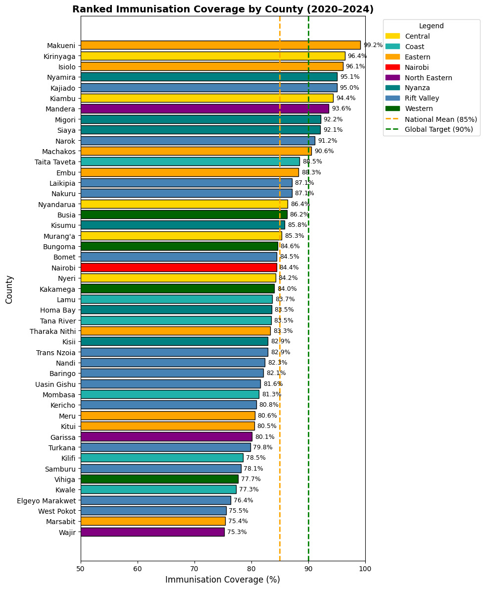
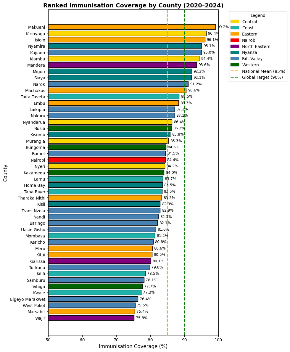
Using annual county population estimates from the Kenya National Bureau of Statistics (KNBS) to normalise the immunisation data,23 we calculated the weighted average immunisation (DTP3) coverage for all 47 counties in Kenya for the period 2020–2024. The results were visualised in a bar chart.
Vaccination trends
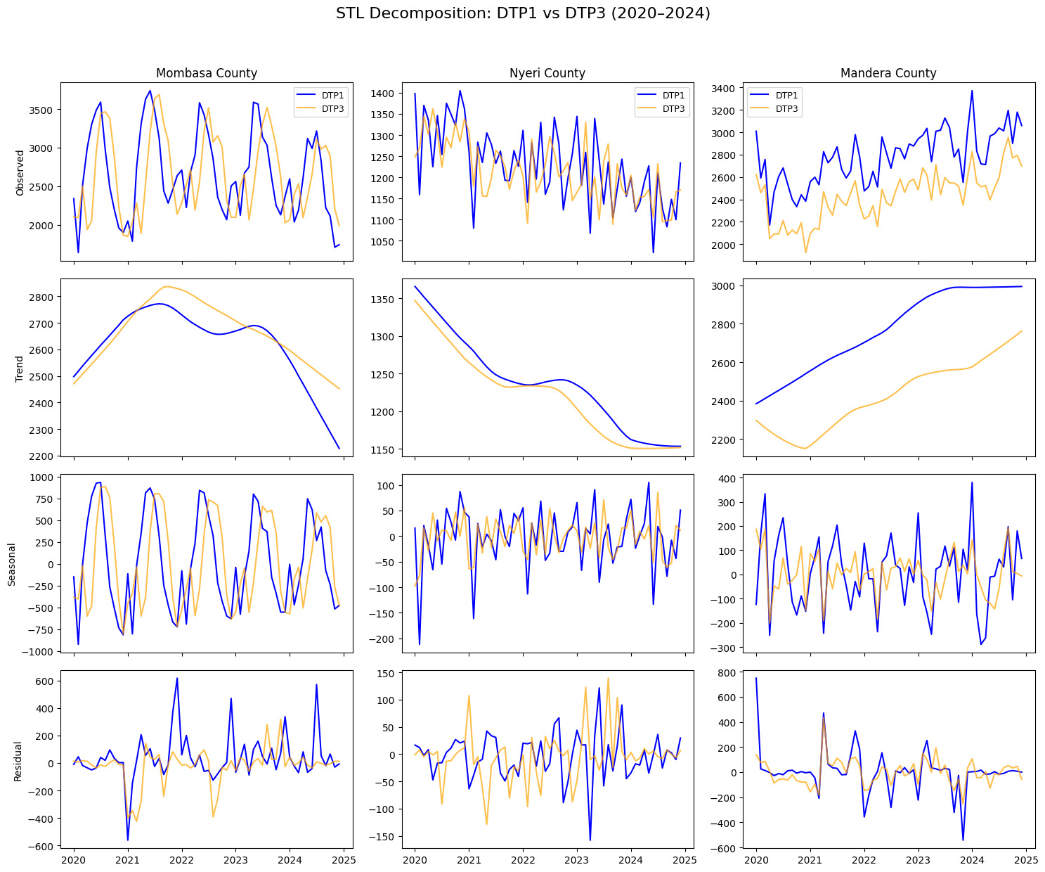
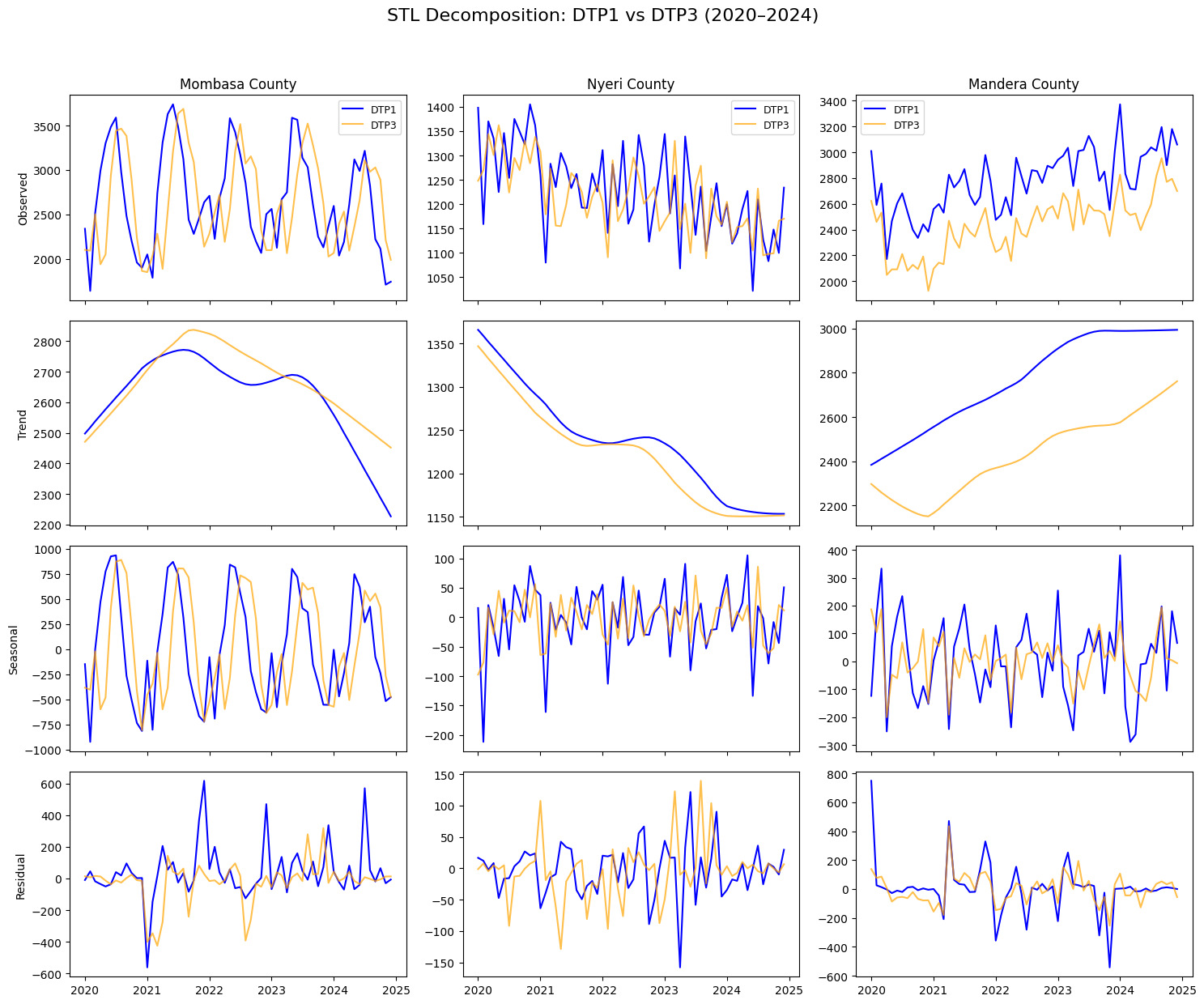
We generated time-series subplots for all 47 counties to visually assess temporal patterns and heterogeneity in DTP1 and DTP3 vaccination trends across counties over the study period. The unit of analysis was the county-month, representing monthly vaccination counts for each county from 2020 to 2024. To evaluate the robustness of observed vaccination trends to COVID -19 related disruption, we conducted a sensitivity analysis excluding April 2020 through March 2021, the period during which vaccination services were most severely affected. We applied Seasonal-Trend decomposition based on Loess (STL) to separate long-term trends from seasonal and irregular components, in order to better characterise underlying trend behaviour and recurring seasonal patterns.30 After visual inspection of the time-series plots, we purposively selected three counties with pronounced and distinct temporal patterns for STL decomposition. This was implemented in Python’s Statsmodels library.31
Dropout rates
To align the cohort of children who received DTP1 with those who subsequently received DTP3, we applied a two-month lag when calculating monthly dropout rates. This adjustment reflects the standard immunization schedule, in which DTP doses are administered at approximately 6, 10, and 14 weeks of age. Without this lag, comparisons of DTP1 and DTP3 doses within the same calendar month would misalign vaccination cohorts and underestimate true dropout. Although the application of the two-month lag may not accurately capture data distortion due to delays in service utilisation, late vaccination and catch-up campaigns, this approach is consistent with WHO and UNICEF data analysis guidance, which recommends accounting for the interval between doses when evaluating sub-national or monthly coverage data.32 The results were displayed in a bar chart.
DTP1 to DTP 3 Dropout Rate (\%)=(DTP1m−DTP3m+2DTP1m)×100
Where:
= Number of DTP doses given in the first month
= Number of DTP doses given after a 2 months interval
In the instances where negative DTP1 to DTP3 dropout rates were encountered, the observations were retained in the analyses and correlation plots as the analysis aimed to characterise observed relationships using reported data, including variability arising from reporting inconsistencies.
Health Facility distribution per 10,000 population
From the KHFML,20 we extracted the list of health facilities and, using the total county population estimates sourced from the KNBS,23 we calculated the number of health facilities per 10,000 population for each of the 47 counties.
Geospatial Analysis
County-level administrative boundaries were derived from the Global Administrative Areas Database (GADM) using level 1 shapefiles.28 Major lakes were sourced from the Natural Earth database.29 Geospatial processing and visualisation were conducted in Python,33 employing the geopandas library34 to map and analyse facility distribution across counties.
Two maps were generated side by side to allow visual comparison of DTP1-DTP3 dropout rates and facility distribution across Kenya’s 47 counties.
Correlation Analysis
We examined associations between DTP1–DTP3 dropout rates, DTP3 immunisation coverage, and health facility density across 47 counties (2020–2024). Two propositions were tested:
-
Higher dropout rates correspond to lower immunisation coverage.
-
Counties with fewer health facilities per population have higher dropout rates.
Both Pearson’s correlation coefficient (r) and Spearman’s rank correlation coefficient (ρ) were computed to assess relationships. Pearson’s r evaluated linear associations, while Spearman’s ρ—a non-parametric measure less sensitive to outliers—assessed monotonic relationships, providing a robust comparison, given county-level variability.
Simple linear regression was used to quantify the predictive effect of immunisation coverage and facility density on dropout rates. Scatterplots were generated with regression lines (95% CI) and annotated r and ρ values. Counties were colour-coded by province to highlight regional patterns. Statistical significance was set at p < 0.05. Analyses were conducted in Python version 3.10.
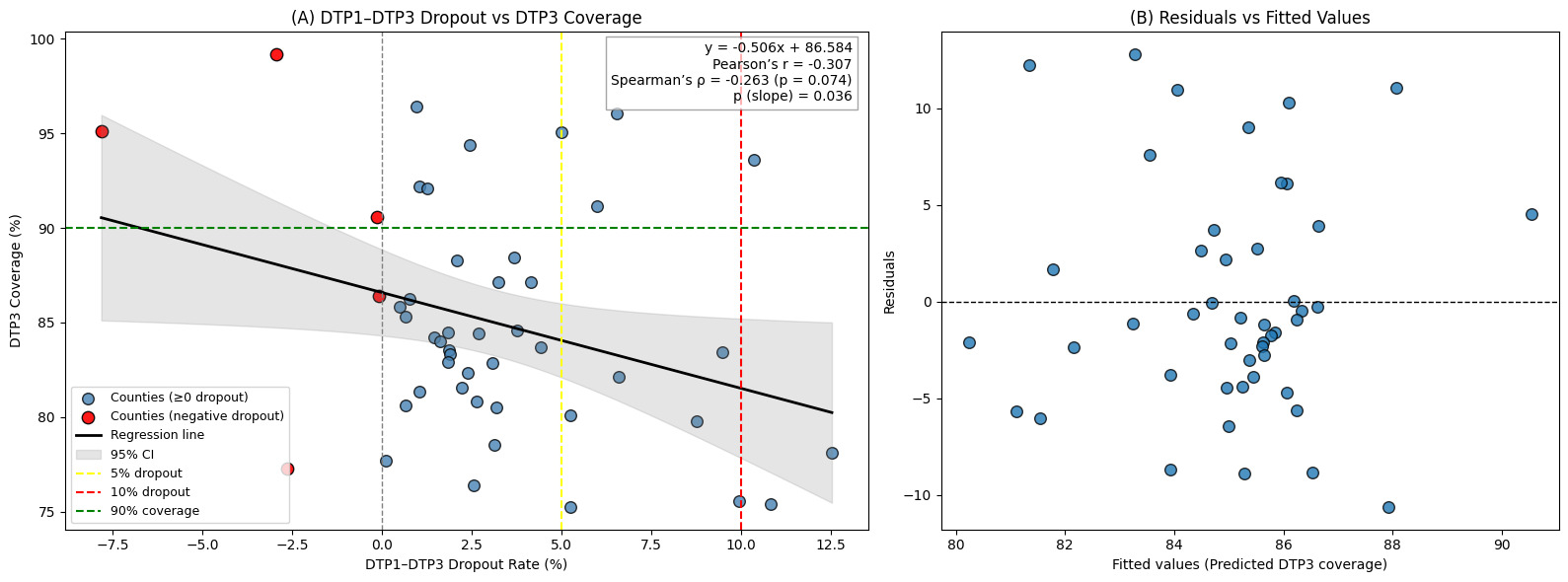
Linearity and normality were evaluated through visual inspection of scatterplots and fitted regression lines. Homoscedasticity was assessed visually using residual-versus-fitted plots.
RESULTS
Immunisation Coverage
Across Kenya’s 47 counties, the average DTP3 coverage from 2020-2024 ranged from 99.2% to 75.3%. Eleven counties exceeded the global target of 90%. The national mean coverage was 85.1% while the median was 84.6% (IQR 80.6%-87.1%).
Counties from Central and Eastern province dominated the top ranking with Makueni (99.2%), Kirinyaga (96.4%) and Isiolo (96.1%) recording the highest coverage. In contrast, Arid and Semi-Arid Lands (ASAL) counties in North Eastern, Eastern, Rift Valley, and the Coastal regions exhibited low performance, with Wajir recording the lowest coverage of 75.3%, well below the national average.
Nairobi, the capital of Kenya reported moderate coverage of 84.4% aligning with the national median but below the highest performing counties in Eastern and Central. Intra-regional disparities were most pronounced in Eastern Province, with coverage ranging from Marsabit (75.4%) to Makueni (99.2%), a 23.8 percentage point gap. These findings are illustrated on figure 1.
Analysis of Monthly DTP1 and DTP3 Vaccination Trends (2020-2024)
County-level time series plots shown in the Online Supplementary Document(supplementary figures 2 and 3), displayed the monthly trends of DTP1 and DTP3 vaccination numbers for all 47 counties. Overall, most counties demonstrated higher counts of DTP1 doses compared to DTP3 and a dip in both DTP1 and DTP3 vaccination numbers between 2020 and 2021 during the COVID 19 pandemic, followed by a rapid recovery.
Coastal counties such as Mombasa, Kilifi, Kwale and Lamu showed clear cyclical patterns with mid-year peaks and end-year troughs in both DTP1 and DTP3 vaccinations.
Most of the counties demonstrated a general stable trend in both DTP1 and DTP3 vaccinations over the observed period. Mandera and Wajir, both from the north eastern region however showed a consistent upward trend while in contrast, Nyeri and Kwale had downward trends in vaccinations over the same period.
Seasonal-Trend decomposition based on Loess
The STL decomposition of DTP1 and DTP3 for Mombasa, Nyeri and Mandera revealed distinct dynamics in the underlying trend, seasonality and variability of immunisation performance (figure 2). Mombasa, one of the coastal counties exhibited rising trends with strong seasonality characterised by regular mid-year peaks and high residual variance. Nyeri, an agriculturally stable county in Central Kenya showed minimal seasonal effects and small residuals but a gradual downward trend across both DTP1 and DTP3. Mandera, a county located in the ASAL region of North Eastern Kenya displayed a sustained upward trend for both DTP1 and DTP3, weak seasonality, and high residual spikes.
Sensitivity Analysis of Vaccination Trends during COVID-19 disruption
After removing the months of April 2020 through March 2021, when routine immunisation services were most disrupted, county level vaccination DTP1 and DTP3 vaccination trends remained unchanged, indicating that the findings were robust to the pandemic effects. This is depicted on supplementary figure 4 in the Online Supplementary Document.
DTP1-DTP3 monthly Dropout rates (2020-2024)
Across the 47 counties, the average two-month lagged DTP1-DTP3 dropout rates for 2020-2024 showed wide variation. Dropout rates ranged from 0.5% in Kisumu to 12.5% in Samburu. Six counties had negative dropout rates that may be reflective of data inconsistencies: Nyamira (-8.1%), Makueni (-3.03%), Kwale (-2.77%), Vihiga (-0.19%), Machakos (-0.13%) and Nyandarua (-0.07%). Excluding negative values, the national mean dropout rate was 3.9% (range 0.1%-12.54%) while the median was 2.6% (IQR 1.61%-6%) - both below the 5% caution threshold.
Four counties exceeded the >10% red-flag threshold: Samburu (12.5%), Mandera (12%), Marsabit (10.8%) and West Pokot (10.0%). An additional seven counties fell into the 5-10% caution threshold range: Tana River (9.5%), Turkana (8.8%), Baringo (6.6%), Isiolo (6.5%), Narok (6.0%), Garissa (5.3%) and Wajir (5.0%). Counties in the ASAL regions were disproportionately represented among those exceeding the 5% caution threshold.
In contrast, some counties including Kisumu (0.5%), Kirinyaga (0.9%) and Murang’a (0.7%) achieved dropout rates well below 1%. This was illustrated on supplementary figure 5 in the Online Supplementary Document.
Relationship Between Dropout Rates and Immunisation Coverage
Despite wide intercounty variability, a weak negative correlation was observed (Pearson’s r=-0.307, p=0.036) (figure 5). Similarly, a Spearman’s rank correlation yielded a comparable weak negative association (Spearman’s ρ = –0.295, p = 0.041), confirming that the relationship between dropout rates and coverage remained consistent even after accounting for non-linear patterns in the data. There was a general tendency of decreasing DTP3 coverage with rising DTP1-DTP3 dropout rates. For every 1% increase in dropout, DTP3 coverage declined by 0.41% (P=0.036). Although modest in magnitude, this pattern was consistent across correlation and regression analyses, indicating a small but systematic inverse relationship between dropout and coverage across the 47 counties.
The 95% confidence interval (CI) was narrowest around the 0-5% dropout range, where most counties were concentrated. Conversely, the confidence interval widened considerably at both extremes – counties with very high dropout and those with strongly negative dropout points. Notably, some counties combined high coverage (>90%) with either very high dropout (>10%) or strongly negative dropout rates. There was a clustering of 21 counties (44%) that had a low dropout of <5% but still failed to achieve the 90% coverage target set by WHO. Six counties (13%) exhibited negative dropout rates. This is shown on figure 3.
**_relationship_between_dtp_coverage_and_dtp1-dtp3_dropout_rates_across_counties_from.png)
Relationship Between Dropout Rates and Health Facility Distribution
The national average facility density was 2.89 per 10,000 population. Of the 47 counties, 22 (46.8%) had facility density above this threshold. These counties had a relatively low mean dropout rate of 2.6%. The remaining 25 counties (53.2%) fell below the national average and recorded a higher mean dropout rate of 4.4%. This is illustrated on supplementary figure 6 in the Online Supplementary Document.
Linear regression suggested that for each additional health facility per 10,000 people, dropout decreased by 0.3%. However, the correlation was weak (Pearson’s r =0.07, p=0.6558) and not statistically significant. A complementary non-parametric analysis using Spearman’s rank correlation (ρ = –0.12, p = 0.42) similarly indicated a weak, non-significant negative association. This suggests that variation in health facility density alone explains little of the observed differences in dropout rates across counties.
However, regional differences were apparent. Counties in the eastern region generally clustered in the higher range of facility density and had low dropout rates. In contrast, counties in the western region had among the lowest facility densities nationally, but still maintained low dropout rates. Central counties were concentrated around the national average facility density and recorded consistently low dropout rates.
Dropout rates and health facility density across the 47 counties were visualised on 2 maps. This additional information is available in the supplementary section (supplementary text 1 and supplementary figure 7) in the Online Supplementary Document.
DISCUSSION
We investigated subnational immunisation system performance in Kenya by evaluating immunisation coverage, DTP1-DTP3 dropout rates, and health facility density per 10,000 population. We also explored temporal vaccination trends and seasonal patterns.
Regarding immunisation coverage, well resourced counties from Eastern and Central geographical regions ranked well above the national mean coverage of 85.1%. In contrast, low performance was observed in ASAL counties from North Eastern, Rift Valley and Coastal regions, which are encumbered by harsh climatic conditions and low economic output. Findings published by Allan et al.35 concur with this observation; their Kenyan study reported that the odds of full immunisation were at least 74% higher among children residing in the Coast, Western, Central, and Eastern regions compared with those in the North Eastern region.
A clear, though modest, inverse relationship was observed between dropout rates and coverage, underscoring dropout as a useful proxy for assessing immunisation service retention and system performance. This finding aligns with a study that examined immunisation system performance in 15 West African countries between 2000 and 2007 and reported that countries with consistently high vaccination coverage generally exhibited lower DTP1 to DTP3 dropout rates.36
DTP1 and DTP3 monthly vaccination trends over the five-year period revealed that most counties recorded higher DTP1 than DTP3 counts, with the gap between the DTP1 and DTP3 coverages remaining fairly constant, reflecting the possible inability of immunisation systems to retain children until the completion of the DTP primary series. A study done across 24 African countries found that inequalities in dropout persist across subnational levels, even where national averages appear stable.37
The disruption in immunisation programmes caused by the COVID 19 pandemic from 2020 affected most low and middle-income countries, including Kenya.38 The rapid recovery in almost all counties in kenya by 2021 points to resilience of the national immunisation program to disruption. It however contrasts with the WHO’s analysis of the status of immunisation in Africa39 that reported that most countries had not fully recovered by the end of 2022. The post-COVID 19 rebound may therefore reflect recovery in immunisation service provision based on administrative dose counts, rather than direct evidence of restored vaccination coverage among the target population. Changes in doses delivered may also reflect the administration of previously missed doses following uncertainity at the start of the pandemic.
Nyeri - a well-resourced county, showed a concerning decline in both DTP1 and DTP3 vaccination counts from 2021 to 2024. This unexpected continued drop in vaccination counts may however reflect a reduction in birth rates rather than service delivery failure. Winkler-Dworak and colleagues in 2024,40 demonstrated a short - term decline in the number of births in 2020 and 2021 across higher income countries, which they largely attributed to women postponing childbirth until the return of normalcy. The observed decline in Nyeri may also be linked to population mobility with young adults out-migrating and consequently shifting the child population base. However, the underlying drivers of this phenomenon remain unclear. Kulu et al.41 examined the spatial aspects of fertility and their influence on population dynamics in Britain and similarly observed that fertility tended to decline with increasing urban settlement size. These demographic factors were not examined in this analysis and therefore remain contextual hypotheses for the observed declining trend.
Coastal counties such as Mombasa showed strong seasonal fluctuations in both DTP1 and DTP3 uptake, characterised by regular mid-year peaks and end year troughs. This pattern suggests that immunisation service delivery is not uniform and is influenced by cyclical factors which may include climatic variations, mobility linked to tourism and labour migration, or periodic vaccine stock challenges. A study in Nigeria found that when vaccine stock-outs occurred, routine immunisation numbers dropped significantly, with the effect persisting for several months.42 Recognising and planning for predictable seasonal variations could help optimise service delivery and ensure vaccine availability during peak demand periods.
Nearly half of the counties had facility densities above the national average of 2.28 per 10,000 population, and recorded a low mean dropout rate of 2.6%, indicating that areas with a greater concentration of health facilities enabled more children to access immunisation services. Distinct regional patterns were also evident, with counties in the Eastern region clustering in the higher facility density range and exhibiting correspondingly low dropout rates. Similar findings were reported by Joseph et al. in a Kenyan study which found that children residing more than two hours away from a health facility had 44% lower odds of being fully immunised (AOR = 0.56; 95% CI 0.33–0.94).18 This expected finding reinforces the fact that equitable access to care is strongly associated with retention of children within the immunisation system. Interestingly, Western counties - despite having some of the lowest facility densities nationally - still maintained low dropout rates. The most plausible explanation for this was offered by Moturi and colleagues who examined geographical accessibility to public health facilities at county level and found that, although facilities were relatively few, most could be accessed within 1 hour in counties across the Western and Nyanza regions.43
The overall association between facility density and dropout was weak (Pearson’s r =0.07 and Spearman’s ρ = –0.12), suggesting that factors beyond facility density such as immunisation service quality or demand-side factors may play a larger role in shaping dropout patterns. Evidence from these two studies in Malawi and Kenya shows that although spatial access to immunising health facilities affects immunisation uptake, substantial variation exists across regions and is influenced by broader access barriers and health system constraints.18,44
Our study has important implications for Kenya’s devolved health system. The subnational disparities in immunisation coverage, dropout rates and health facility distribution highlight the need to improve equity in immunisation service delivery. Counties in the ASAL regions which continue to experience low coverage and high dropout would benefit from targeted investments, including prioritising health facility expansion within underserved areas as outlined in the Kenya Health Sector Strategic Plan (KHSSP 2023-2027).45 The rapid recovery following disruptions in immunisation service provision during the COVID 19 pandemic illustrates the resilience of the National Vaccines and Immunisation Programme, emphasising the value of sustained efforts in health systems strengthening. These actions are aligned with Kenya’s commitments to the Immunisation Agenda 2030 (IA 2030).46 DTP1-DTP3 dropout rates can be generated and reported through the Kenya Health Information System (KHIS) and reviewed during routine performance meetings at both sub-county and county levels to inform planning, supportive supervision and prioritisation of interventions.
Limitations
This longitudinal ecological study relied on aggregated administrative data, which are subject to reporting and denominator inaccuracies. Negative dropout rates reported in some counties in a few counties indicate the presence of data-quality challenges, possibly due to delayed reporting, population movement, or duplicate entries. The study design also precluded individual-level inference and assessment of demand level factors affecting immunisation performance. In addition, health facility data did not distinguish facilities actually provided immunisation services, potentially overestimating coverage. Facility density alone is an inadequate proxy for access because it does not capture staffing, cold-chain capacity and commodity availability.
Recommendations
Future research should prioritise improving the accuracy and completeness of immunisation data at subnational level. This can be done by strengthening electronic registries and conducting routine administrative data validation. In counties with struggling immunisation performance, qualitative analysis may provide more nuanced insights into the determinants of dropout. Incorporating geospatial accessibility models into health facility distribution by population mapping, can offer a more complete understanding of physical access barriers particularly in the ASAL regions.
CONCLUSION
Subnational disparities in immunisation performance persist across Kenya and are closely linked to variations in access and system capacity. This study highlights the need to report subnational dropout data alongside immunisation coverage data to facilitate actionable assessment of immunisation system performance. Strengthening county -level systems, enhancing data quality, and addressing geographic and socioeconomic inequities are key steps in closing the remaining immunisation gaps.
Ethics Statement
Formal ethical approval was not required as the study involved analysis of aggregated administrative data with no direct participant recruitment or intervention. All data were de-identified and could not be traced back to individual children.
Disclosure of interests
The authors declare that they have no competing interests.
Funding statement
This study was not funded.
Data availability statement
All the raw data and analytical code used in this work is available in a repository
Authorship Contributions
CK: Concept, analysis and initial draft
RJ: Data acquisition, critical review of the paper
AA: Concept, analysis, critical review of the paper
FW: Concept, critical review of the paper
MBvH: Critical review of the paper
WO: Concept, analysis, critical review of the paper
All the authors approved the final version for publication and agreed to be accountable in addressing concerns in integrity or accuracy of the work
AI Use Statement
Artificial intelligence tools (ChatGPT and Gemini) were used in language editing and coding assistance. All the text, analyses and results were reviewed and validated by the authors.
Additional Material
Additional material is available as an Online Supplementary Document.
Corresponding author
Christine Karanja-Chege
Kenyatta University
P.O. Box 43844-00100
Nairobi, Kenya
chege.christine@ku.ac.ke